
 Follow
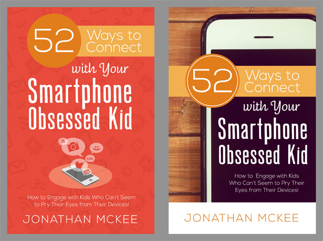
My publisher just sent me two sample covers for the new book I’m writing to parents about connecting with their “Smartphone obsessed” kids.
Which cover do you like better? Use the comment feature below… in fact… anyone who includes their name and city in their comment, I’ll drop your name in a hat to win a free copy of the book when it hits the shelves. I’ll draw 5 names and give away 5 of them!
Or take a peek HERE at the other books I’ve written
(or my Amazon author page HERE).
Posted in Books | | Leave A Comment
The one on the right, for sure.
Dan in Milwaukee
I like the one on the left. The color, pics and layout are inviting.
Tammi in Louisville, KY
The one on the right.
The one to the right seems more appealing
Chris in Tulsa
The one on the right…
The one on the right.
I think they are both good options, but personally I like the one on the left. I think the logos representing different technology (texting, LOL-speak, Instagram, Twitter, etc) will grab the attention of the parents who feel intimidated by their lack of understanding of those areas.
Matthew from Killarney, Manitoba, Canada.
I was wondering when someone would vote for one on the left! Thanks for being the brave one!
The darker one with the phone.
Rob from Thousand Oaks, CA
The cover on the right with the iPhone.
The one on the right.
I like the one on the right–darker background with a picture of an iPhone. The red one just looks like any other book and doesn’t pop out at me at all.
Janie Platt
Fraser, MI
I’m going with the red one on the left. I personally like both, but when speaking with parents that are at times a bit clueless, they will understand that better.
Ha… we parents are a bit clueless. I think we need as much help as we can get! (Of course, we don’t know that until we’re parents, and then we learn that even more when we are the parents of teenagers!)
The one on the right definitely!
Hannah & Adam Yth Leaders Sumner, Iowa
Left Side
Danny from Saint Louis
The left one is android with a very material design feel. The right is more iOS with the organic feel of the wood background and photo feel of the cover… I’m an android guy myself.
Jason Kite Lubbock Texas
Well… I won’t hold that against you. 🙂 (I accepted Apple into my heart 5 years ago and it has slowly transformed my mind)
Definitely the one on the right.
Kyle from Owenton, KY
The one on the right, definitely!
And I meant to add this, but I’m in Denton, Texas!
The one that stands out the most is clearly the one on the right. The one on the left isn’t bad, just doesn’t pop as much as the one on the right.
James in Newark, DE
Very cool to read a comment from someone in Delaware. I’m originally from lower, slower DE – Milton, near Rehoboth Beach. God bless!
Straight up- one on the right
One on the right is better.
Jesse from Adrian, MI
My vote would be the one on the right. If smartphones & their use are the main centerpiece to the book, which the title would suggest, then it makes sense for the iconic smartphone to be the attention grabber on the cover.
Josh in Manhattan, KS
The one on the left
On the right!
The darker one on right side with Iphone
I really like the one on the left (Red Cover)!
Joey from Huntsville, Alabama
I prefer the one on the right! My eyes were instantly drawn to it and I wanted to read the title! Congratulations!
Lori Fallon
Monticello, AR
Without a doubt the one on the right, with the large iphone on the cover. So much better.
Aaron in Jasper, IN
The one with the big phone and wood background
Victor from Dallas
Although I like the one on the right, the one on the left will pop out more and be more appealing to moms.
The one with the phone, it grabs my attention and explains visually what the book is about better than the plain reddish one.
…Although I kind of wish it wasn’t “52” ways. At first that made me think it had to do with a calendar app or scheduling help for busy people, and distracted me from what it is really about.
I like the one of the left, the red cover
Scott
Brentwood, Ca.
The one on the right caught my eye first. Go with that one!
Deanna from Des Moines – oops – forgot to say that!
The one on the right.
Sandy in San Antonio, TX
The one on the right. It seems to stand out just a bit more.
Barnesville
My eyes were drawn to the picture of the actual phone book cover first. It would be great if you could somehow incorporate the logos of Twitter, Instagram, etc on this book cover because I believe logos can be intimidating for parents and confusing if they are not part of the parents social media world. Finally a reliable source to help me navigate the social media waters. Parents may wonder which logo belongs to which social media and if you do not know it makes you feel dumb and entirely not-connected. Perhaps the logos could be superimposed on the edge of the phone or something? Number 52 really jumps out on this particular book cover as well. Thanks for including your audience in this decision-making process. Another testimony of how you really care about what we think.
Shawn from Schaefferstown, PA
The one on the right is my preference. Visually it’s cleaner and has a more modern look.
Laura from Cincinnati
The one on the right. Because you are talking about smartphones, it draws your attention to the book.
Definitely the one on the right. Agree with the comments to add the various social media logos to it.
Nick Johnson
Gilbert, AZ
I like the one on the right….Cindy from Clinton, MS
I’m going with the one on the left with the orange cover for sure. The one on the right is harder to read. I have to look longer to read the info on the cover. God luck!
Love the one on the right!!!
~ Cherie from High Springs, FL
I think the one on the right with the phone on the cover is the best. It is more modern looking. 🙂
The one on the right!
Gretel Roberts
Dallas, TX
I definitely like the orange one (on the left) better. I love all of the activity there!
LOVE the right one – it is more eye catching to me.
Thanks for writing and sharing the cover…
not the one on the left
Red one on the left looks more professional in my opinion, and a little more “timeless.” The one on the right may seem quite outdated in 5 years.
Mike F.
New Brunswick, Canada
Cover on the right with the big phone! It’ll grab “Big” attention! Way to go Jonathan!
I definitely like the one on the right, It looks great, will get people’s attention and is let’s you know that the book is about smartphones even before you read the title.
Vance Y.
Turlock, CA
The one on the right with the smart phone.
The smart phone cover-Redlands, Ca
The orange one (L) definitely! Chusi G. Coppell, TX
I like the one on the right – feels more contemporary.
The one on the right, definitely.
Paul Loeffler, Moses Lake, WA.
I like the one with the large phone.
Phil from Vancouver, WA
I prefer the one on the right. I find the title pops better.
Kevin Downey Chilliwack, BC, Canada
The right one with the smartphone. This cover really jumps out at you. It looks more “modern day”. The one on the left did not catch my attention at all and appears “dated”.
Heidi Moore, Hoschton, GA
I prefer the one on the right – with the picture of the phone, up against the wood grain.
The one on the right catches my eye. I’m from Brick, NJ
The one on the right for sure!!!! 😉
The one on the right, simple and clean lines.
I meant left haha
I prefer the one on the left, the one on the right is visually appealing but looks like a magazine cover. The left cover has very subtle illustrations that go along way.
Jesse from Mansfield, Ohio!
My vote is the one on the right. Grabbed my attention much better. Seemed clearer regarding the topic of the book. I liked the design.
Jeremy Hetzel
Colorado Springs, CO
The one on the right with the phone. Easier to figure out what the book is about and a lot of parents aren’t any better then their kids with the phone, it will speak to them as well!
The one on the right – but you could tinker with which phone you use. : )
The one on the right. Sheesh, parents better get their heads out of the sand and understand what their kids are doing! Looks like a great resource. Tracey from Naperville, IL
I like the one on the right. My son votes for that one too 🙂 He says if you’re in a book store, the phone will catch your eye and you instantly know what the book is about.
Jen, Sacramento
I am in favor of the one on the right. It has a more modern, catchier appeal.
Jared Burkholder from Emmaus, Pa
The one on the right caught my eye.
The one on the right 🙂
I prefer the one on the right for parents. The cover on the left looks more inviting for a teen audience.
The one on the right. It makes it clearer that it deals with phones.
The one on the right
Jessica from Findlay, Ohio
I vote for the one on the right…
-the large phone on the cover makes it obvious what you’re addressing
-the cover in general seems more “current”, with the wood background, etc.
-the white lettering is easy to read on the black of the phone screen
Put my name in the hat, please. 🙂 -Kecia Melton from Gladstone, Oregon
I like the one on the right with the picture of the phone.
The one on the right…
Bill from Albuquerque, NM
Thanks, Jonathan!
One with the phone, although both look good, I like that one he best.
Kevin Hand
Spartanburg, SC
Sorry. To clarify. The One on the right. Lol. Needing a weekend soon.
I like the book on the right.
The one on the right looks more appealing and catchy to my eye.
David
Paragould, AR
Left! For marketing purposes alone it draws attention, cautions and creates a call to action 😉
My initial reaction was the one on the right; but I quickly settled on the one on the left. Who knows how long the current iPhone will be the standard image of a mobile device. If it changes, the cover will make your book look outdated before they even read a word!
I like the left option. Better fits the title of the book.
They are both good designs, but the one on the right will stand out more when a parent is looking quickly at images and once it has captured their attention, then the content can persuade them to buy it and read it and love it.
When it popped up on my e-mail the one on the left stuck out right away. It was bright and looked like it would be something easy to read, whereas the one on the left looked like it would have big words and no pictures. 🙂 When I clicked on it and saw them close up, I do like the design of the one on the right, but would say that I prefer brighter colors so I would go with the one on the left and it seems like something that wouldn’t take a year to finish reading. If they made brighter colors for the one on the right I would like it more since it is a unique cover. Layton from Evart, Michigan
The one on the left feels a little cleaner.
wes from Bronte, Texas
The one on the right ties in better with the theme of the book.
The right one! It looks a lot cleaner =)
The one on the right 🙂
In regards to the book covers: I must admit that I think they need to go back to the drawing board. The left is drab in color…..if going with color, then really make it pop. I believe more women will appreciate the left. The cover on the right probably appeals to men more, as it is more crisp and business like. Being a man, I would say the better of these two choices is the right, but I believe something better is out there. I recommend taking designs from your subscribers. There are probably some really creative and brilliant people at your disposal. Hope this helps. Keep up the good work. Your brother in Christ…..ROCKY
Right side looks more enticing to an adult parent.
Phil
Indianapolis.
The book cover on the right with the picture of the I-phone caught my eye. Maybe it a sign I have an obsession with screen media. If I were to be walking the aisles of the bookstore the other cover would blend in. If I was just browsing I would probably miss it.
The one on the right is the clear winner. The left one looks outdated.
-Chad, Cedar Rapids, IA
I like the one on the left. I have grown weary of pictures of smart phones (everyone’s doing that). The one on the left is attractive and minimizes the phone in the overall scheme of the cover, which seems to be the implied purpose of the book.
Albuquerque, NM
I like the second cover with the smart phone photo. I think it will capture parents’ attention more if they are looking to cut back their children’s use of cell phone.
Houston, TX
Love the one on the right. It caught my eye right away.
And you know where I live.
Right side
Lance Mayes, San Antonio TX
Left or red one.
JJ
Berthoud ColoRADo
Right one looks bolder, so right one since I prefer bold covers xD
I like the cover on the left better.
Anthony Applegate
Brenham, TX
I like both actually. But the red one on the left speaks more to what the book is about IMHO.
Tamara, Arroyo Grande, California
Wood background and phone definitely!
I’d be more drawn to the one on the right. Although I get the comments in favor of the left one.
Tyler from Tracy, CA
I like the one on the right. Should have the cellphone on the cover.
The one on the right – looks more catchy to me.
Tristan from Ocala, Florida
I like the one on the right.
the one on the right will draw in both the obsessed student and the frustrated and at-wits-end parent.
Ben from San Jose
The one on the left looks more “active”. Also, it will stand out more on bookshelves. I like left.
Tom, Adrian Mi
The one on the right. The picture of the phone is eye-catching and gives you an idea of what the book is about. It will stand out if parents are looking for a book about their kids phones.
The cover to the right. Picture of phone and the colors used. I like the one on the left, however it takes several moments to figure out what’s happening. The cover to the right takes me a nano second to figure out whats going on and is intriguing.
right is the right one for me!
Gaborone, Botswana. And yes! Kids are obsessed with smart phones here as well.
I like the one on the left Jonathan; it somehow seems more appealing to me. I look forward to getting this book for sure, for myself and to help parents also.
Thanks again!
Ronald Winters, San Jose, Ca.
I would say that one on the left. Before long, the one on the right will look outdated—actually, with the iPhone 6 series, the right cover already looks a year or two old. I have a feeling that it will be more obvious with the iPhone 7 series.
Marc Hyde
South Bend, IN
I like the one on the right with the black background but both look great
Andy
Hillsdale mi
the cover on the right
Marcus,
Miami, FL
I prefer the one on the right (black).
I am from North Wales PA
The one on the right, for sure.
Jeff
Sterling, Ks
The one on the right is my favorite. The white font against the black background stands out more. The image of the phone is more eye-catching.
Definitely the one on the right.
From Cookeville, TN. The one on the right.
The one on the left. As a cartoon, it will date slower than an actual image of a current smart phone. That way it won’t look old in 9 months and silly trendy youth pastors won’t scoff at it.
Brycen Marner
Ferguson, MO
the Kulture
The one on the right seems to catch my attention!
Cindy
Riverside, CA
I like the one on the left – Red Cover – simpler in my opinion. I like the idea of a less is more and Google uncluttered look.
Micah
Salina KS
Definitely the one on the right!
The one on the right is visually more appealing and might grab someone’s attention. The one on the right looks mundane and I don’t know that a parent would know what those icons mean. So…my vote, cover on the right.
The one on the right is visually more appealing and might grab someone’s attention. The one on the right looks mundane and I don’t know that a parent would know what those icons mean. So…my vote, cover on the right.
Dover, DE