
 Follow
Take a second and use our comments feature below to tell me which book cover you like best: A, B, or C? (I’m finishing writing this book now- it will be on the shelves in 2017.)
- Which one would you be most inclined to buy?
- What do you like about it?
- Anything you don’t like? (Don’t force a criticism… just let us know if anything initially struck you weird.)
We value your comments!
Posted in Books | | Leave A Comment
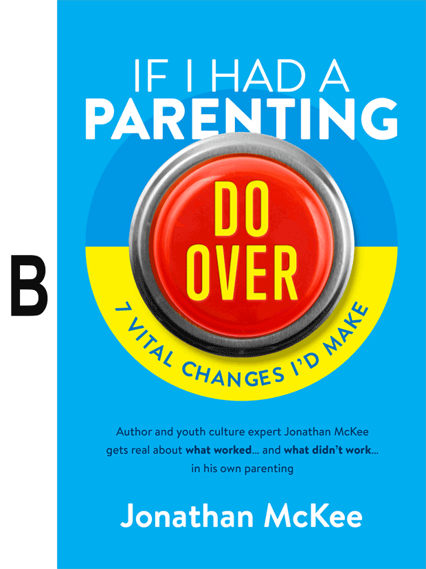
Cover B. I like the yellow, and it’s more pleasing to the eye in the curved format than the straight on cover C.
Cover B – The yellow is nice, and the curve looks better.
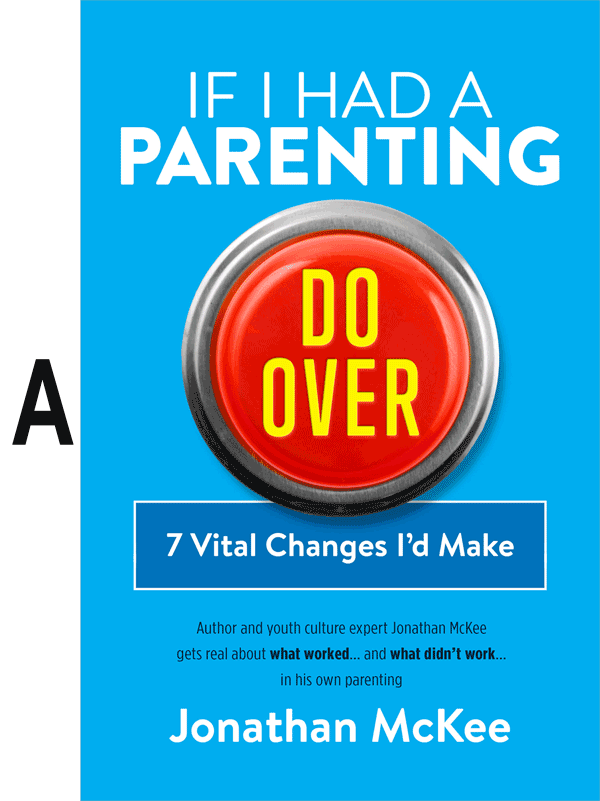
I choose A
It grabbed me the first and subsequent times that I compared all three. I liked the yellow in the button and felt the other two options had too much yellow in them.
Can’t wait to read it! As a mom of 4 (19, 17, 12 and 11) I have had a chance to tweak my parenting a little with my 2 younger ones. Thankfully, I don’t have too many regrets with my older teen daughters but I know there’s always room for improvement:-)
Thanks Robin… I’m glad you’re excited to read it! It is interesting how much we change and adapt for our younger kids. I know I did.
B
B – definitely more appealing
I like B!
Ok, I was going to say C, but as I took some time to look at them all again to explain my reasons why, I’ve had to change my answer to B. I like the yellow. The circle on B initially seemed distracting, but on the more I looked at all three of them I realized that A & C are just missing something and are too boring. So I’m going with B.
I had the same thought!
Cover B
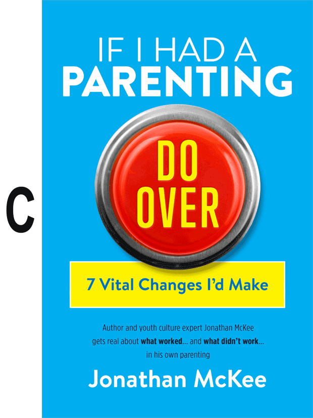
Sorry… we don’t allow any changes. C was your final answer! 🙂
C is easiest to read.
Option B. Nice integration into the primary graphic, and more eye-catching than the 6,004 other books on the shelf with a subtitle in a box.
If you went with the rectangular subtitle, I wouldn’t make the primary graphic overlap it, but move it down so it mimics a label like you would see underneath a button in real life.
I like A
B
Looks balanced
B
I like the symmetry with the ring around the button. The rectangles in the others seem out of place.
Cover C
C.
B — I like the colors and the way they blend…
I like “B”. To it looks focusedand to the point. If I’m a parent looking for ideas. Or thoughts I’d purchase B.
Cover C.
That layout is more easy to read than B, but the yellow makes the subheading pop more than the dark blue.
I agree….go with C
Hi Jon,
“C” has my vote. Most visually appealling, does not introduce another color (i.e. darker blue on “A”), not busy like, “B” Easier to read full title. Sub-title in the B is hard to read.
My vote is B!
I like C, I could sure add some stories and would love to read your book. I have a 39 year old daughter and 19 year old granddaughter and a 17 year old granddaughter. And still a youth pastor. I am still learning.
Thanks Larry! Me too! Never stop learning!
Definitely “B”
C
B – the curve looks so much nicer. The box looks out of place.
I like C. Several folks said that they liked the curved text on B. That is exactly what I don’t like about B! I don’t dislike A, but I prefer the color consistency of C.
I know I’m in the minority here, but here’s my answer and reasoning…
A is my favorite, as “Do Over” is the focus on that cover more than the other two. With the yellow background of options B and C, the focus is shared by “Do Over” and “7 Vital Changes I’d Make”. Also, the yellow background makes the beginning of the title “If I had a parenting” disappear.
Just my 2¢…
I like B
B or C Jonathan; the yellow catches my eye on both of those covers compared to the A cover. I think I actually like B more as I type this, so B!!!!!!!!!!!!!!!!!!!
That’s a lot of exclamation points, Ronald! 🙂
I like option B the best. It felt quicker to read and know what the book is about.
B
I was immediately drawn to B. It was more pleasing to my eye and seemed to really work together as a whole and I seemed to read and understand it quicker and more holistically.
I like B but I think I would like the “If I had a parenting” part separate from the button and not tucked under it.
All are very eye-catching and would attract me as a consumer. My preference is B.
C: I’m a sucker for red yellow and blue. I guess I like superman…
And the circle around the button in B looks weird to me
Superman! That’s awesome. Never thought of that. I’ll talk to my publisher about making little capes for each book!
A
I like B
A – the blue cover and blue box allow the Red/Yellow ‘Do Over’ to stand out.
B is coolest looking, C is easier to read to quickly get the message
A
I prefer “A” because I feel like “do over” gets lost in the other 2 choices. I like simplicity and I am drawn to A.
Thanks for writing this book… And good luck writing!
Thank you for being a loyal reader, Lori. It’s been an interesting writing project, melding current research and polling with the adaptations I’ve made over the years.
C is the one I like. B makes my dizzy, and on A the “7 Vital Changes” banner is lost in the blue, not enough variation for my eyes. I think that the yellow banner on C seems to take care of that issue. So, again, just for emphasis: C
BTDubs, looks like another helpful resource, can’t wait to see it!
Thanks Sam. And we’ll see if we can provide some anti-nausea meds with the book if they go with cover B.
I vote for C
i like B but I think you should lift the words “If I had a parenting” so that none of the letters are behind the button. i think lifting the letters a little would be an improvement. I also like the font from the B image on the bottom that starts “Author and youth culture expert….” – it’s a little chunkier or wider and easier to read than the same letters in A & C.
is that TMI?
Never TMI from you Dan!
I’d say B. I not only like the yellow, but the curve around the button is a bit different than the more traditional rectangle of C.
Design B.
Nothing wrong with the others. Just the most visually appealing to me.
C.
I like B…..smoothly attractive!
I choose C.
Sorry, but I don’t care for any of them. The red “staples easy button” looks odd in the book and a “true” blue color would be more pleasing to my eyes in combination with the red. Would it help to highlight “parenting do over” in some way instead of just “do over?”
B
First pick is “A” simple, nice, do over draws people in to want to read more. Love the title! Second pick would be “C”. Do not care for B. But none of the covers would cause me not to purchase your book. U r an amazing writer! Thanks for all u do!!
I thought for sure the part of this book you’d like the best is the last name of the author!!!
B The color combination is striking and draws your attention. The curve of the circle is easy on the eyes and stands out next to other “boxy” book titles.
Cover C
B. I like the curved yellow that makes the circular button stand out. The only thing I would change is to move the text above the button up slightly to separate it from the button.
B is the most eye-catching to me!
B
C is the best. I don’t like the graphic layout of B. Overlapping the word parenting is distracting.
B
B Definitely highlights the “7 Vital Changes I’d Make”
A
Cover B – Catches your eye better
I like B with the yellow supporting the subject.
I like A. others have too much yellow
I like A – nice balance and appeal. C would be a close second, and I didn’t like the overlap of B.
I like B. The contrasting colors and the supporting shape are eye catching.
Personally I like A. I am not a fan of reading in curves of B, and for some reason the yellow of C seems to pop more then the Do Over button. I think the Do Over button should pop more. Looking through your comments…. You could print all three and someone would buy them!
Yes… but we want EVERYONE to buy one! 🙂
A or C. I don’t care for the big yellow “smiley face” under the help button, looks a little cheesy and doesn’t accentuate the red button as much. I’d probably go for C over A since the 2 blue colors together don’t look amazing to me.
I like A the best because I think with the subtitle in blue, it keeps the main title, “Do Over” as the first thing to grab the eye. It is more subtle. I definitely do not like the yellow in option B or C, and I especially do not like the subtitle curved around on option B. Finally, option B and C look like something a Trump supporter would vote for, so I staying clear away from them! (That was sarcasm, folks…)
Ouch!
I like B the best. The curve is inviting and the yellow is cheerful and engaging. It actually made me smile when I saw it 🙂
C. I don’t like the smiley face looking subtitle because it doesn’t accentuate the help button as much, and I don’t care for those 2 colors of blue together as much.
Ha… never saw the smiley face… UNTIL NOW!!! STOP SMILING AT ME, BOOK!!!
B.
B
A
My vote is B and so is my wife’s.
B
I am going to go with B. At first I liked A, but the more I looked, I like how the yellow accentuated the “Button”
C for sure. Simple and attention grabbing is always the best for a book cover. Too much time spent on trying to read the curve in choice B. Book browsers only have limited time when out shopping for their next read!
I like C. The yellow is eye-catching but stands out more than the curved version.
I like C
Very Easy to read
Good Ratio of color
B or C. The yellow stands out better. Although I like the look of B best, C is easier to read.
I like C the best. I like the yellow – it pops, and I like that the button is over the top of the yellow box on the bottom, whereas in B the button is over the Main Title – which doesn’t look right to me.
I would pick C.
B – the yellow curve.
C
A.
C
B
I like B.
I like B
It looks like the yellow around it is a gauge or level. That if you push the button the yellow will travel around and show your parenting levels…
I like B.
I think it highlights the sub-title well giving importance to it. Can’t wait!!!!
B
A is more pleasing. Don’t know why…just one of those “grabs you or it doesn’t” things.
C
I vote B!
A
For me it is more readable and and all of the text pops out without “trying” to read it.
I like A. The others have too much yellow, makes them seem more like an info-mercial.
I like B!! I like them all but B is the best and will sell the most. Like a million copies. Remember me when that happens.
Ha… let’s both hope!
I like cover C. The subtitle stands out with the yellow and it looks very appealing.
B
B much more eye catching but black font of smaller writing not as well defined or clear as others.
B, It just makes me want to see what this is all about compare to the others.
Cover B
It’s the one that my eyes kept gravitating
toward.
No doubt about it.
B.
Love the design and the yellow is what pops off the shelf to me making it “eye-catching.”
I like the B Book. It does not make all the title blend together
B
I’m feeling C because it pops better. I am definitely interested in reading this book as well. I appreciate your heart and your passion to help parents succeed. Thanks for helping making my ministry better!
Thanks for the encouraging words, Jake!
Cover C. Seems more balanced with the rectangle below the button but more noticeable in yellow.
Cover C.
“B” gets my vote. Seems the most eye catching and inviting, looks balanced.
Cover B. Very eye catching!
COVER B
B
I like the curved yellow. Makes me think of positivity, a smile. 🙂
C
I actually tried to push “B” because it looked so button-y. I love judging your book cover.
A (it’s simple and easy on the eyes)
B
I like C. I like the yellow but the yellow circle on B somehow loses me!
I think the yellow grabs your attention more, so I would say B or C. C is the ultimate one that I would choose, because it catches my line of sight more than the curved example on B. In a book store I would probably skim the first part of “B” and keep walking, where as “C” keeps my line of sight/reading and I read the whole thing. That was my first thoughts.
Thanks intended for offering this type of good content
Fantastic internet site you’ve there
I really like B with the curve. However, I’d move the button down just a fraction so it doesn’t cover the word Parenting. I love & have all of your books!